

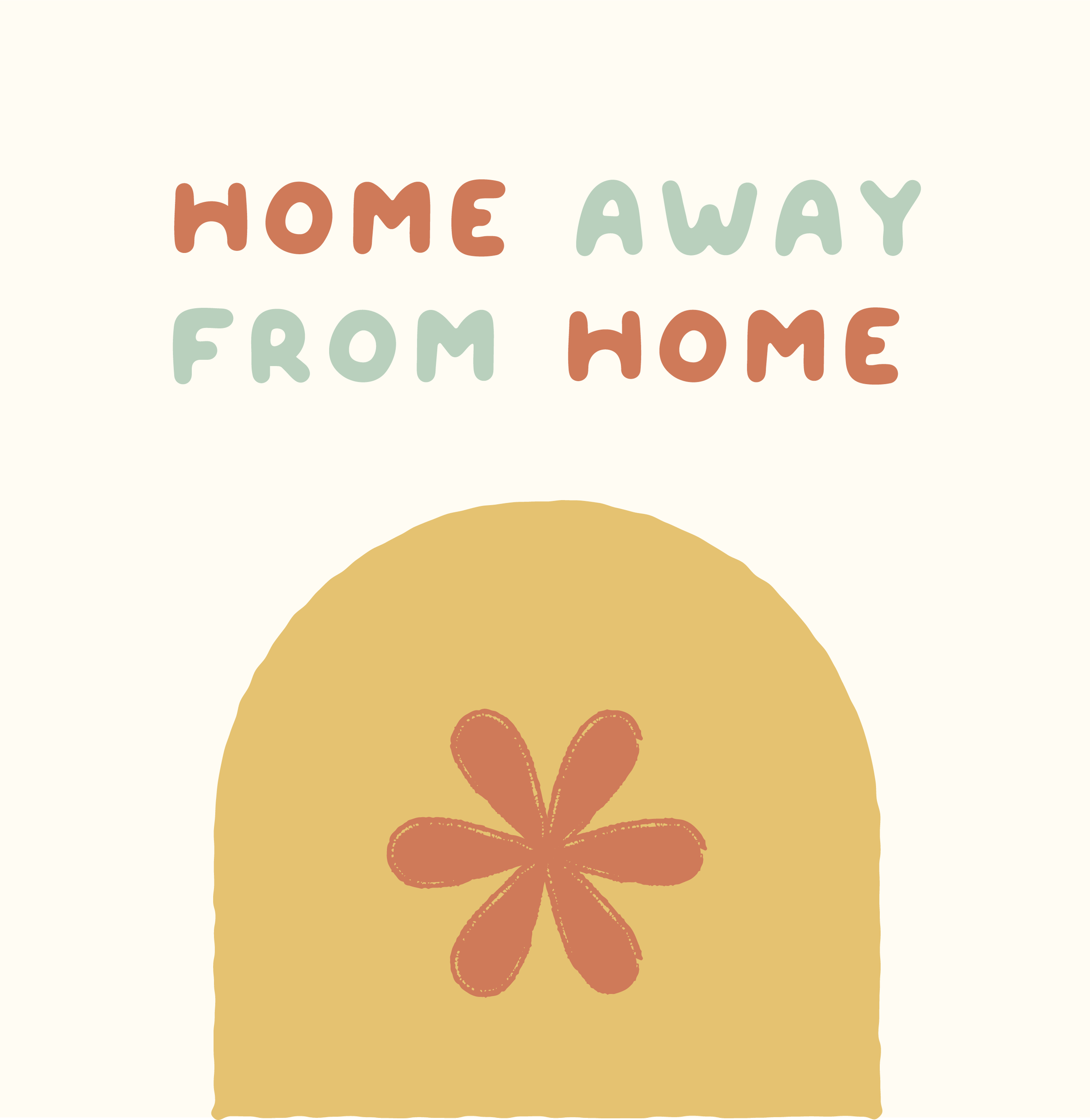
norwood kids
Project Type: Branding, Website
Vibe: fun, inviting, playful
Industry: Childcare, daycare
Norwood kids is a Montessori, childcare space with a playful ethos that believes in exploration and hands on learning. The goal was to make the brand stand out from competitors in the area, while being attractive to both children and parents. Competitors in the area had slightly dull and dated branding, so curating a purposeful, fun colourful palette makes Norwood stand out as the fun and inviting choice. The use of shapes in a brand pattern and wiggly animations further show the playfulness of the brand. The brand was applied to social media posts, website and marketing collateral to strengthen brand consistency and recognition across all client touch points.


brand goals
To create a stand out childcare brand that communicates the brands playful ethos


design notes
Using textured shapes, a bubbly font and a modern colourful palette makes the brand playful and fun, appealing to both children and parents in a way that doesn’t feel too childish.


more work
-
![Studio NKC]()
Studio NKC
-
![Primrose Event Planning & Design]()
Primrose Event Planning and Design
-
![WCEM]()
WCEM
-
![A Petal For Your Thoughts]()
A Petal For Your Thoughts
-
![The Oasis]()
The Oasis


think we’re a creative match made in heaven?
GET IN TOUCH
let’s be friends
Let’s make it Instagram official. Follow us on social media to see what we’re up to, studio updates and probably a dog photo or two.