

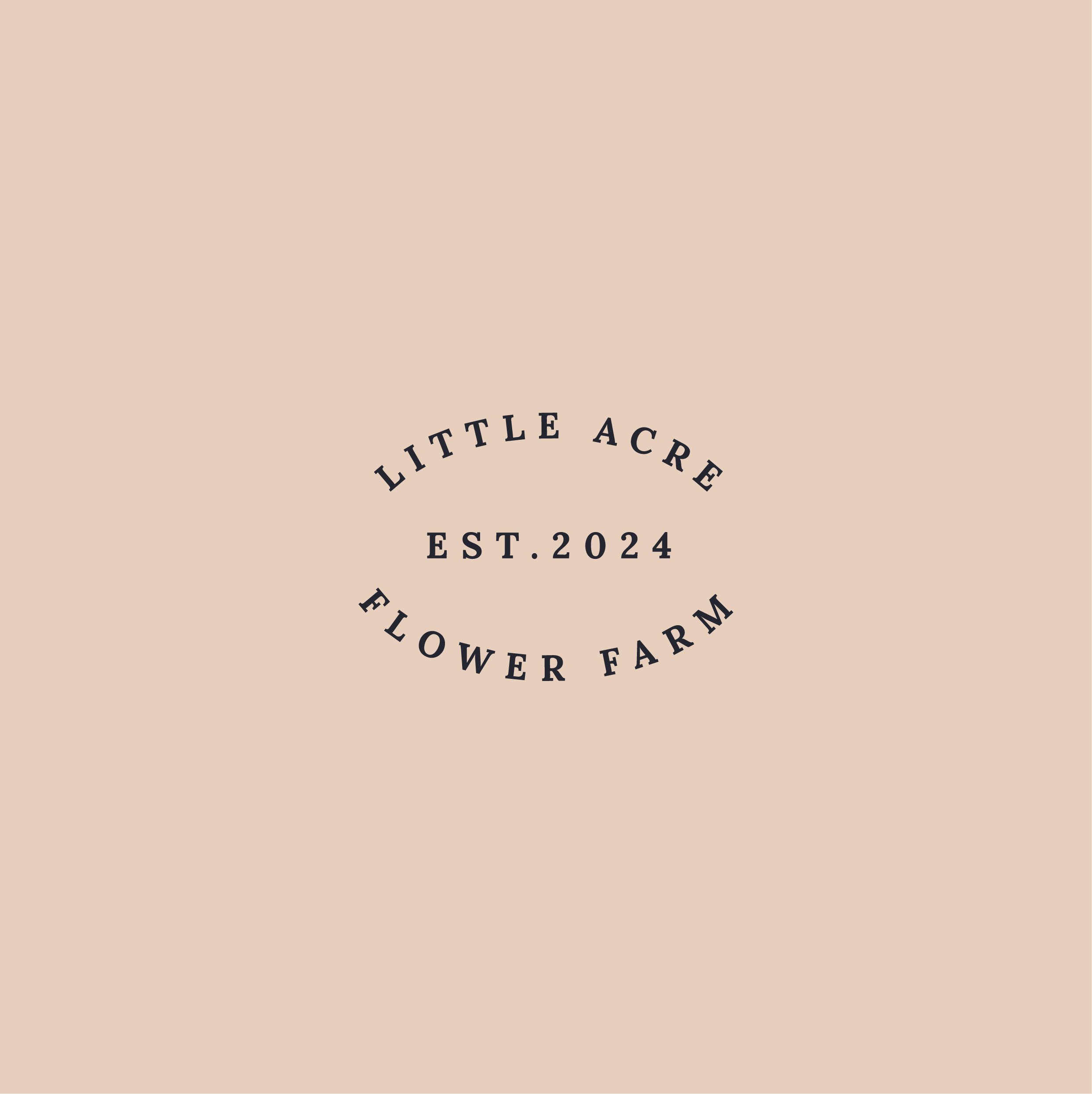
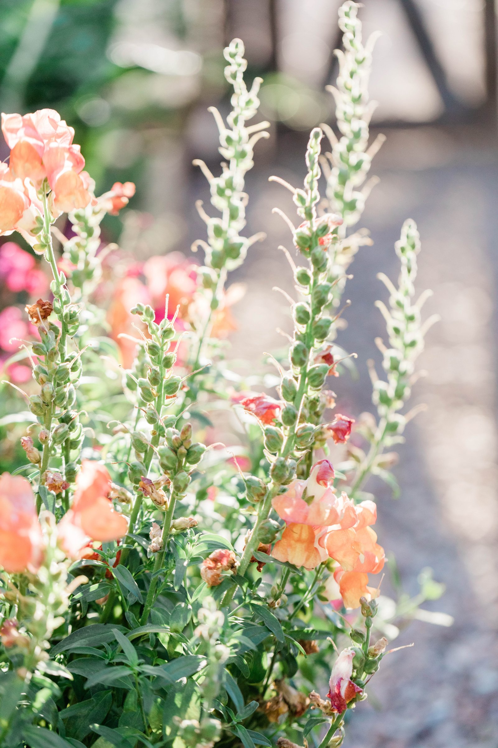
Little Acre Flower Farm has a love for local blooms and a commitment to sustainability.
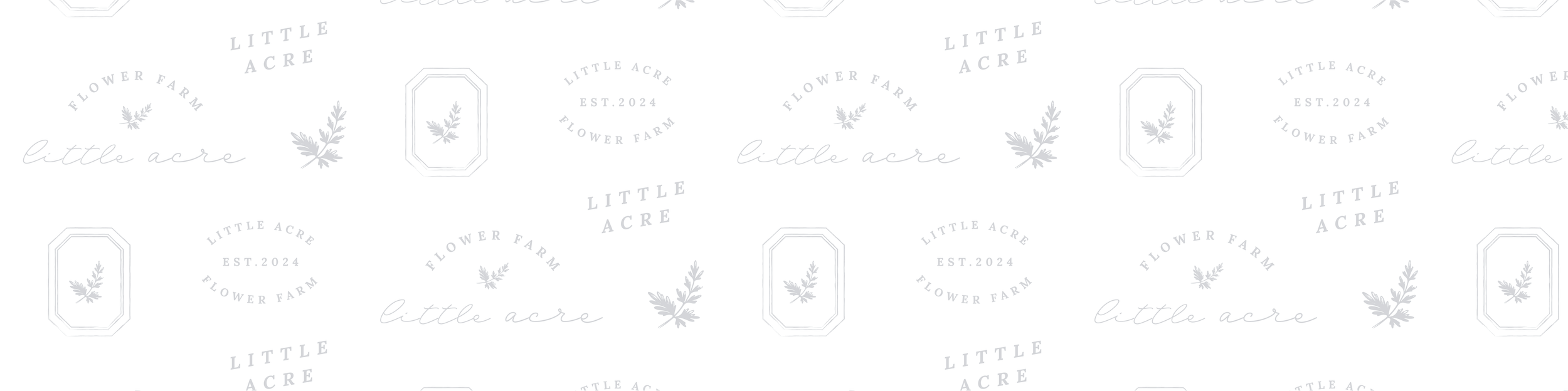
The flower farm landscape leaned heavily on a vintage aesthetic so we captured the nostalgic feel in a fresh, modern way that feels charming and inviting without feeling too feminine by using serif typefaces and navy, purple and peach tones. The script font gives a hand crafted feel to the brand.
We created several patterns including a hand drawn plaid pattern and botanical illustrations. These patterns create a vintage, handmade feel and are used as a graphic element to create depth and brand recognition.
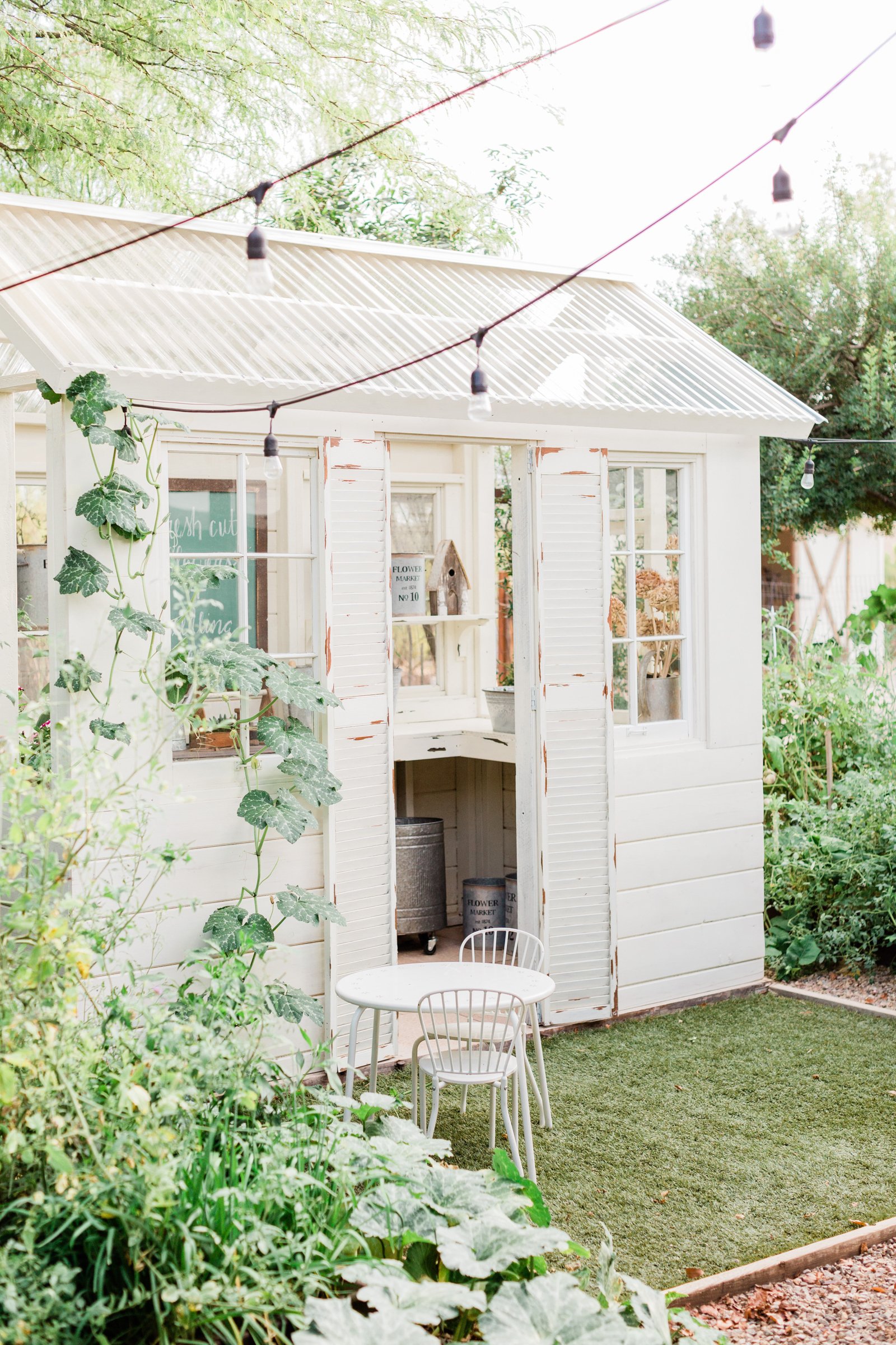
The flower farm brand identity extends across various marketing materials, including seed packaging, mailers, social media templates, and merch, ensuring a cohesive and memorable experience for every customer online and offline.
little acre flower farm
Project Type: branding, logo design
Vibe: Nostalgic, charming, vintage
Industry: Floral farm, florist


Design notes
Using botanical sketches, hand-drawn patterns and a serif font create a nostalgic, vintage aesthetic. These extra elements make each step of the guest experience from buying to unboxing feel cohesive and special.


My favourite portfolio projects

studio nkc
Branding for an Interior Design Studio
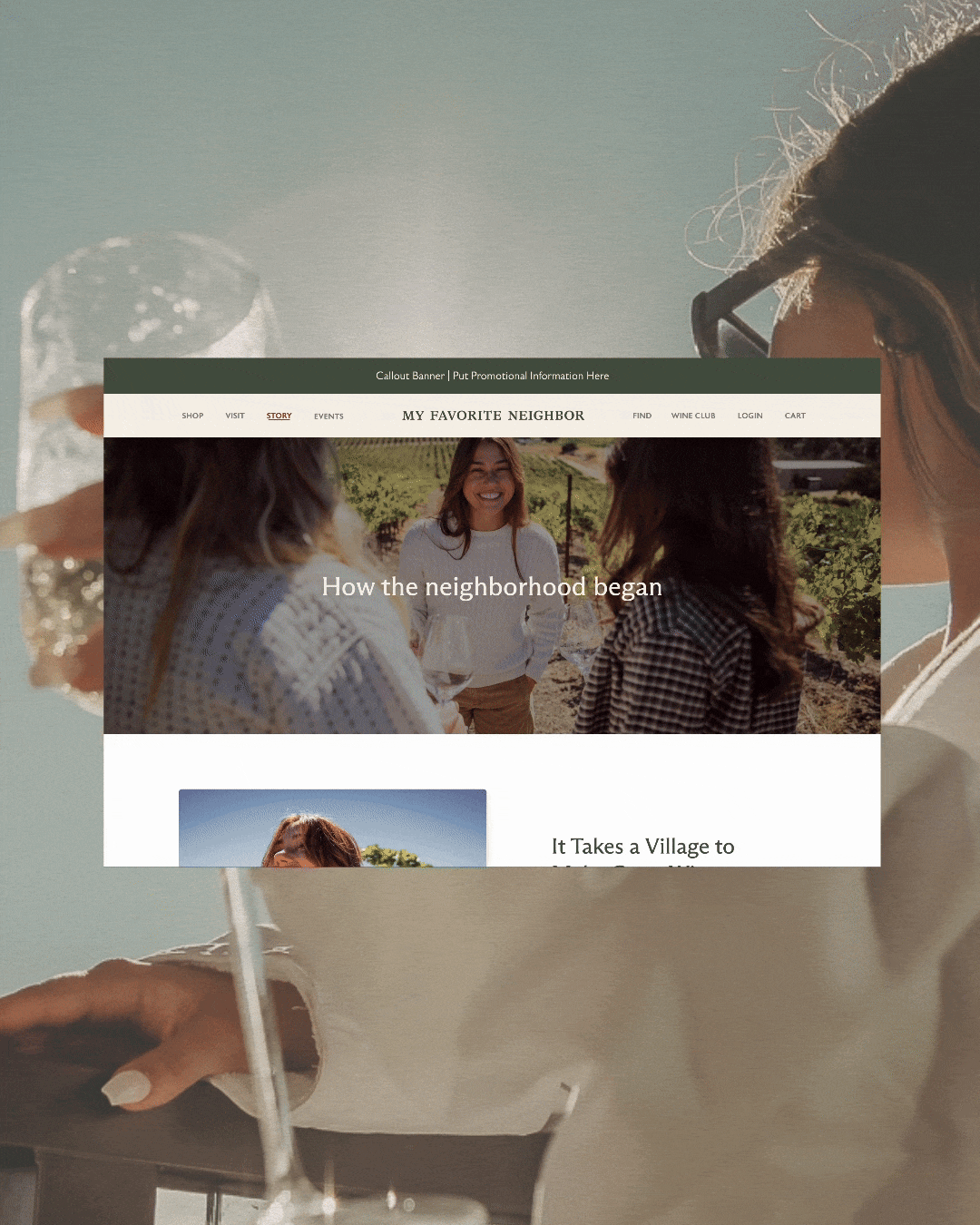
my favorite neighbor
Website for a California -Cool Winery
Forte studios
Branding for a Edmonton Photographer

I’m Shaylyn, a (one of a kind) brand and web designer who works with heart-led, intentional businesses. My goal is to make it easier for you to grow with integrity, confidence, and ease.
Through intentional brand strategy and the perfect combination of beautiful, yet meaningful design, I’ll make your ideal clients instantly feel like you’re a match made in heaven.
If you want to stay connected you can:
View my portfolio to view past work, and client testimonials.
Read my blog for free branding insights and tips
Check out my services for all the awesome ways we can work together on your brand or website (I promise to be the most fun expense you submit to your accountant)
Download my service & pricing guide to get a feel for what working together looks like..
Or you can always just send me an email, or schedule in a free (no awkward, no strings attached) discovery call to see how I can help you with your brand.
Choose your own adventure, and whichever you choose, I hope you have a beautiful day. ☀️